Fuck me, I just realized a couple days ago that it’s been almost eight months since the last time we did one of these EYE-CATCHERS posts. I guess it was always a variant on the MISCELLANY posts, and that series has continued while this one languished — until today.
In case you’ve forgotten, EYE-CATCHERS was both an experiment and a vehicle for discovering new music. The experiment was designed to test the completely illogical hypothesis that cool album art tends to correlate with cool music. There’s really no reason why the two should go together, but in my experience, they do, more often than not.
Of course, my experience has been completely anecdotal, with no statistical significance behind it at all. Undoubtedly the day will come when I’ll see a cool cover and then run for the vomitorium after I start listening to the tunes. But from the time when we started this experiment last April until it petered out in July, most of our test cases validated the hypothesis.
Today we’re reviving the experiment. It’s also yet another random way to make listening choices from the enormous pile of metal that’s constantly accumulating here. For those of us at NCS, randomness is appealing because we like surprises, and also because our lives are pretty much a collection of random experiences anyway.
So, today’s test cases for this renewed experiment are Illdisposed (a venerable band from Denmark who’ve got a new album coming); Blaspherian, from Texas (who also have a new album on the way); and a Finnish band called The Undivine. After the jump, we’ll reveal our test results and provide you the musical evidence, too.
ILLDISPOSED
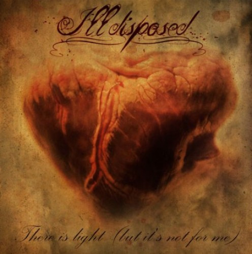
 These Danes will be releasing their tenth studio album, There Is Light (But It’s Not For Me), on April Fool’s Day via Massacre Records. The band recorded the CD at Antfarm Studio in Århus, Denmark with producer Tue Madsen (Moonspell, Dark Tranquillity, Gorefest, jillions of others). I saw an item about all that news on Blabbermouth, and it included the album cover at the top of this post.
I hadn’t heard any of this band’s previous output (you may now mutter to yourselves, “And this ignorant tool is running a metal blog?”), but the album cover (by Lasse Hoile) did catch my eye. It looks like a painting of an actual heart (not a stylized one). Maybe even a broken heart? Anyway, I liked the cover, and I liked the album title, and it happens that the band has made a song from the album available for streaming. So, I listened.
The song is called “Heaven Forbid” and man, do I dig it. It’s a form of melodic death metal with contrasting deep, barking vocals and a catchy-as-fuck chorus. The song is melodic and heavy on the groove, but ominous and evil — and at the end, keyboards rise to prominence, shimmering and groaning. I want to hear more.
Enjoy this song by Illdisposed:
BLASPHERIAN
Now, here’s our next piece of eye-catching album art:
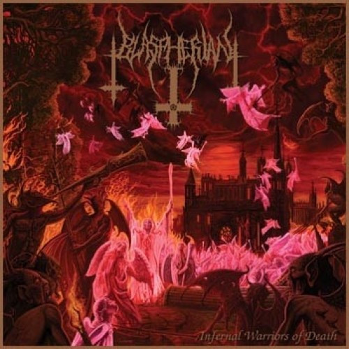
I got a press release recently about this Houston band and the impending March 8 release of their debut album (after several splits and an EP) called Infernal Warriors of Death. The PR piece included the above image of the album cover, which caught my eye. Even before I understood what was happening in the scene, I liked the colors. As for what’s being depicted, well, let’s say it doesn’t look like things are going well for the angels.
 The press release also announced that an underground webzine called Apochs.net was exclusively premiering a track from the album called “Exalted In Unspeakable Evil.” So, I hopped over there to find out what unspeakable evil sounded like, wondering whether the band would speak of it or play an instrumental.
What I got was sure enough evil-sounding — old-school death-doom, with lethargic, massively down-tuned guitars and bestial roars. The pace periodically picks up a bit, but the song always reliably collapses back into an abyssal roaring slog that’s nasty and morbid. It’s not unspeakably evil, because I’m speaking about it, but it’s pretty good.
The issuing label is Deathgasm Records, and Deathgasm is currently taking pre-orders for the album at this location. And, at this page, they’re also taking orders for a combo with a shirt that features the album cover. I’m mighty fucking tempted by that shirt.
Now, here’s that song from Blaspherian. After you hear it, be sure to visit Apochs Metal Review at this location, because their page views (unlike ours) translate into ad revenue, and we don’t mean to deprive them of that.
THE UNDIVINE
We’ve got one more eye-catcher for you. Here’s the album art:
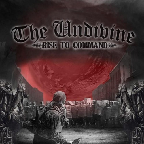
This art is the cover to a four-song EP released last year (the second) by an unsigned band called The Undivine from Lohja, Finland. I discovered their existence from a Facebook post from another upstart Finnish band we like around here called Bill Skins Fifth.
Like that album cover for The Haunted‘s next release that we featured yesterday, I was drawn to this cover partly because the color scheme matches our own NCS colors. But there are other interesting things about it — the juxtaposition of the modern-day, Molotov-cocktail wielding protestor against a shield-bearing police line, with what look like 18th Century advocates argung from the sidelines. Not sure if that’s meant to symbolize the persistence of resistance across the ages, but whatever. It’s still interesting, and it drew me to the music.
 I found two songs from the EP streaming on the band’s MySpace page and listened to both of them. The first one, “World After Us” is a super-heated, blur-paced, cross-bred piece of death and grind – the kind of metal that tries to spin your head all the way around like that bile-spewing chick in The Exorcist. It’s also got a bunch of vocal variation (grindcore shrieking, death-like growling, and hardcore howling), and it includes an extended breakdown of mean, groovy riffage that starts about 2/3rds of the way through. Pretty cool shit.
The next song, “Down With the Napalm Rain”, is a bit more restrained, but just as heavy on the groove and still plenty pissed off. I liked it, too, though not as much as the first one.
The band recently announced that they’ve finished recording a debut album, which they plan to release on April 26. For more info, visit the band’s official site here. And now here’s a ReverbNation widget that will allow you to stream the two tracks from Rise to Command that I heard:
And next up . . .
Nah, not really. Just fuckin’ witchu.
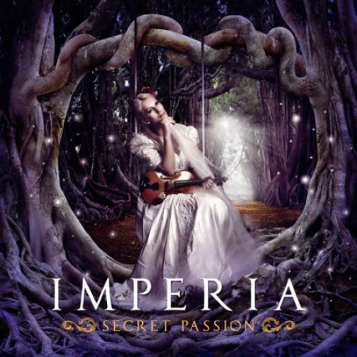
This new album by “Dutch/Norwegian goth metal band” Imperia, due on February 25 from (oddly) the same label that’s releasing the Illdisposed album, would be a test case for the hypothesis that awful album art correlates with awful music. I just can’t bring myself to find out for fear of polluting the fairly nice vibe I’ve got going on from the music of the first three bands. Btw, Imperia’s vocalist seems to have a thing for swings, so maybe it’s not all bad:
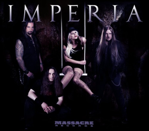
So, putting Imperia aside, today’s experimental results once again tend to confirm the hypothesis about cool album art and cool music, with Illdisposed being the strongest evidence. Their album is one I definitely want to hear.


The Blaspherian cover reminds me of Immolation’s Dawn of Possession cover, like they’re part of the same scene.
That Illdisposed heart sure has an ugly vagina though.
“Dawn of Possession”: Good call! Right down to the cursive album title at the bottom, they’re very similar — and Blaspherian names Immolation as one of their major influences.
“Ugly vagina”: Apparently, this painting is like a Rorschach blot.
Isn’t it a uterus or something?
See my point above about the Rorschach blot. I see a broken heart, byrd sees an ugly vagina, you see a uterus. What will be next?
Does it mean I want a kid or am I just hungry for red meat?
My professional clinical interpretation is that you have an intense desire to return to the womb because the outside world is too scary.
Hmm, good one. That was option no. 3. Not because the world is too scary though, but because I liked placenta.
I just spit up in my mouth.
Oh, I definately see the heart, it just has a very ugly vagina on it Maybe I just have a thing for vaginas though, I own Lords of Acid’s Voodoo-u album even though I can’t stand the music, had to have the album for the cover.
http://mysterybabylon.us/myspace/voodoo_u-front.jpg I’m sick I know.
Very attractive and tasteful. I can see why you had to have that album.
P.S. You need to include NSFW warnings on your comments because I was about 2 seconds away from getting a loud “WTF?” from a co-worker walking by.
Sorry about the NSFW neglect.
This method is actually how I originally discovered Pig Destroyer like 10 years ago – I was walking around the music store (and this was before the time that metal was put into a separate section from just “rock”) and saw Prowler in the Yard. The cover is, of course, a guy sawing off his own leg (also note that this album was released in 2001 and the movie “Saw” was released in 2003, so I give Pig Destroyer full original credit for this idea). Anyway, I knew I had to have the album based on the artwork and now I love grindcore. The end.
Well, this is weirdly coincidental, because I picked up my first Pig Destroyer CD based on the cover art, too. In my case, it was Terrifyer. True story. Speaking of Pig Destroyer, where the fuck is the next album?!
I think I picked up a Demon Hunter album because I liked the cover.
I quickly discovered I should have done a better test listen first.
Same thing has happened at least twice before. Now that I buy almost all my music online, I rarely even know what the covers look like…and I think I’m better for it.
Although I’m really liking Undivine…
And that red thing is clearly the sun finally going supernova and taking us with it…
It does have kind of an apocalyptic look to it. Nice to know that when the world ends, we’ll still be fighting with each other to the last second . . .
I love Demon Hunter.
I discovered Nevermore through the “that looks shiny, i’ll buy it” method as well. On the island of Rhodes no less.
I love some Demon Hunter songs and do not love many others, but I do think their album art has been consistently great (and the Clark brothers have their own graphic design business).
They do indeed. They won a Grammy once as well I believe. Although what that proves I’m not really sure.
With regards to the Illdisposed art, I see a heart, but originally saw a malformed brain due to the fissuring of the top area of the image.
I’m betting those are supposed to represent blood vessels. Anyway, here’s a real one, and that big thing in the painting that looks like a fissure may be just a big artery or vein.
http://www.sciencephoto.com/images/download_lo_res.html?id=802160057
Shit, I’m in full-on wonk-nerd mode now.
Oh it’s clearly a heart alright, you can see one of the valves on the bottom right of it after all.
I don’t recall exactly why I didn’t like Demon Hunter, but I am almost 100% that it was less that it was bad music, and more that it just wasn’t my style….
Whatever that means.
That’s very close to my issue with the band, so I do understand. They’ve got lots of songs that are just too “light” and “metalcore-y” for my tastes. The harder-edged stuff, which still retains catchy melodies, I do like.
It’s actually clear now that you’ve pointed it out that Ill Disposed & Imperia are under the same label…they both have that sort of cursive-y, fuzzy glow-y “girl metal” vibe to them. Am a touch ashamed to admit that I never would’ve given Ill Disposed a second glance after that cover – definitely enjoyed the taste you gave here though and will be seeking out more.
Love covers like that Blaspherian one; 9 times out of 10 when an album looks like that, you know exactly what you’re getting into and you know it’s going to kill. The MS Paint typeface is literally the only thing I would change there. I’m sort of from the camp that believes you should go balls-out with your cover art just like everything else in metal, pushing it to the outer limits of taste can’t hurt.
Yeah, the typeface doesn’t really fit with the rest of the Blaspherian cover, though Immolation did a similar thing for their very similar Dawn of Possession cover (as byrd36 pointed out above):
http://www.metalmusicarchives.com/immolation–dawn-of-possession.aspx
Haha, I have that on tape and the font has always bothered me on that one, too! It doesn’t help that one of my best friends is a typographer who points out crappy font choices whenever we go out somewhere.
Either way it’s good to have my assumptions (drawn from album art covers of all things) challenged, my record pile is starting to look like a big black-and-white scribble pile.
“a big black-and-white scribble pile” You have just revealed much about your listening preferences. Like you said, with black-and-white scribble covers, it’s a pretty good sign of what you’re about to get in the music. At least to me, it screams “raw, nasty, and i-dont-give-a-fuck”!
Oh shit, mine is on tape too, along with several hundred others from ‘back in the day’.
I was surprised that you hadn’t heard of Illdisposed before. Admittedly, they aren’t house hold names in the world of DM, but they have been around since 1991, and when people mention metal bands from Denmark, they seem to be inexplicably overlooked.
They started as a brutal death metal band, but have evolved to the point of being rather melodic with plenty of groove, as evidenced by this song. And of course there is a lot of synth work going on, which took me by surprise but I like a lot — because their sound was becoming a bit stale on their last album (which was still pretty solid).
Anyway, most fans would probably agree they peaked with 1-800 Vindication, but their later work is still very solid particular Burn Me Wicked. Good read.
I’m glad I finally discovered them — I really like this song and am interested to hear the rest of the album. I had heard their name before but just never listened to any of the music and didn’t know quite what to expect. Better late than never.
“most fans would probably agree they peaked with 1-800 Vindication”
True.
I actually only got into them after working at a show they played with Ancient.