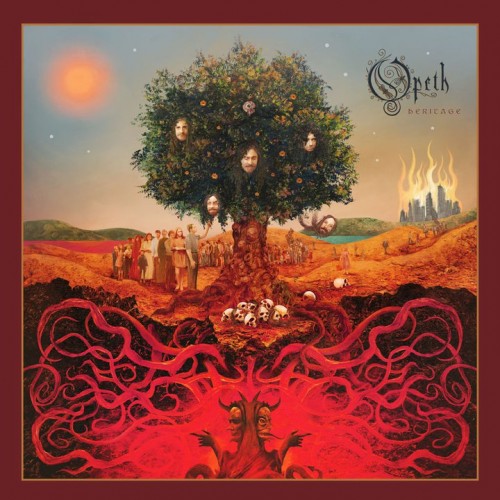
Yes, that’s the opdate, right op there at the top of this post — the just-disclosed cover for Opeth‘s next album, Heritage. The artist is the very talented Travis Smith, who has done many other Opeth album covers in addition to cover art for dozens of other bands you’ve heard of.
So, all you album art critics out there, what do you think? With one lingering reservation, I think it’s damned cool. I love the vibrant colors and the arrangement of fantastical images, and the suggestion of the demonic underground feeding life to the green Opethian tree from which an endless line of fans is feeding (or at least that’s how I’m interpreting it).
The lingering reservation stems from those heads of the band members in the tree. It adds to the psychedelic aura of the whole picture, but it’s also a bit campy.
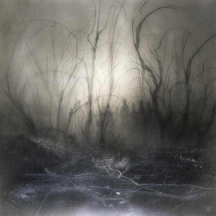
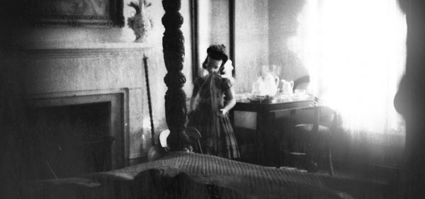
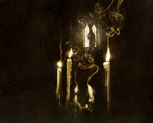
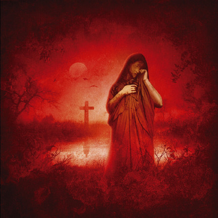
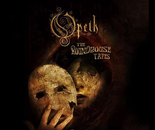
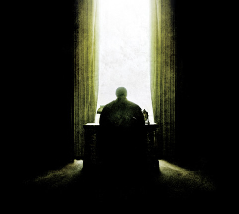
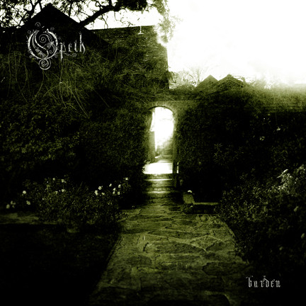
Coming back to the colors, much of what Travis Smith has done for the band in the past has been sombre and monotone (though there have been exceptions). After the jump, I’ve collected all of the cover art he’s done for the band in the past. Take a look — and by all means, let’s hear what you think of this cover.
ALSO, I’ve now got the detailed reactions to this cover of NCS writer BadWolf. He and I each wrote our thoughts without seeing what the other thought. Among other things, he sees this cover as a sign (among others) that Heritage will not be a metal album. Check out what he has to say after the jump, too.
FROM BADWOLF:
Earlier today Opeth released the album art for their upcoming tenth full-length, Heritage.
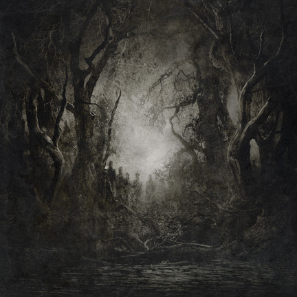
Heritage‘s cover was designed by metal art luminary Travis Smith, who has collaborated with the band many times before.
The cover represents a serious departure from the band’s previous art direction, minus the Roundhouse tapes live album. To say the least, the Heritage cover makes a series of bold statements.
For the first time on an Opeth cover, we see multiple human beings (not silhouettes), and even supernatural beings (the band-tree and Janus-Satan below). These are the first faces on an Opeth cover, and they include the band’s own faces (the Watershed scholar faces away from the viewer, toward the window). To me, this is an acknowledgement that the band members and personalities have, by virtue of Opeth’s popularity, become as identifiable as the band’s music.
Only bands like Slayer, Metallica, Mastodon and Lamb of God can boast such a claim (note all those bands are American). In fact, the band, for the first time, are more prominent than the Opeth logo. It’s also worth noting that even though Akerfelt is clearly front and center, he and the band are physically connected by the tree, which is itself rooted and solid–perhaps a statement on the stability of the band’s current line-up (Opeth, like many death metal bands, has featured a revolving door of members).
Also for the first time we see an Opeth album cover with a complex color scheme—all of the band’s previous albums have focused on one or two colors and black–the scheme worked so well that all the Candlelight Vinyl re-issues of their back catalog are color-coded to the album covers. That will obviously not work for Heritage. Not only are there many colors, but the colors themselves are bright, almost cheery looking. Daylight appears for the first time alongside the mighty O.
Also, we see our first signs of modernity: the burning city at far right. In the past. all Opeth’s images have seemed in the vein of a victorian-gothic time frame; Mikael’s lyrics and (some of) Opeth’s videos have echoed this aesthetic. That the city is at right in a picture full of such obviously Christian imagery is notable–modernity is equated with the lamb, and the lamb is burning with the same fiery shade as the roots of Opeth, and the inferno those roots reach. This sort of open aggressive message on the album cover is likewise new.
The most jarring difference is the way the picture is framed–centered–and its shallow depth of field. Obviously, this picture is meant to hearken back to the Renaissance, with its fixation on geometry and human proportion (look how photoreal Mikael’s face is). Here is where the title comes in: heritage reaches back to the past and the Renaissance pre-dates gothic-victorian Sweden.
So what does it all mean?
Considering that the album cover and title are retrospective in nature and that their previous album, Watershed, featured the least amount of metal in relation to prog since the Damnation album, I think this cover is a clear message that Heritage will not be a metal album. I have other clues: in a Terrorizer magazine interview about two years ago, Mikael said the only metal album he was looking forward to was the new Morbid Angel (two years ago!) and we all know how that turned out. The city burning may itself be a condemnation of modern metal as much as civilized society.
Yes, I would put money down that Opeth have gone full-prog.
And I’m still excited. Opeth have never made a bad record, and all things considered Damnation was probably their strongest work.
So, the Heritage artwork says to me “expect a break from the Opeth we know, and a whole lot less growling.”
AND NOW, HERE’S MORE OF TRAVIS SMITH’S ARTWORK FOR OPETH:

wow, that is an awesome cover!
the only thing that bothers me, not sure if it should, is the fact that Per’s head is falling from the tree, i suppose it represents his departure from the band ( he left/got dismissed this year), and if im right, there will be some controversy surrounding it im sure.
still its a very very cool and original cover.
now i just need some new music and im a happy dude.
Good observation about Per’s head. He did play keys for this album, so it would have been worse to cut him out. Yet, as of now, he isn’t in the band, and Åkerfeldt has said it was sort of a mutual decision and there’s no bad blood. So the way his head was treated in teh cover art isn’t a bad compromise — that is, if you’re going to have heads in the picture at all.
fake cover is fake. or at least the heads will be out of it for sure.
You think so? The band itself announced this as the cover on their facebook page. I think this is the real deal.
I’m tempted to lean towards this being an elaborate joke as well. At least for the heads if not the composition as a whole.
The presentation of the cover is now on the Opeth site:
http://www.opeth.com/index.php/news/show/id/213
Do they have any history of practical jokes?
Yeah, they do occasionally announce weird album titles and things like that, plus Mike is known for making jokes on stage and in interviews, etc.
I hope it’s a joke as I don’t really like it.
I do like the colours and some of the composition, but think the city, the skulls, the devils, all look cheesy.
I’m familiar with Travis Smith’s work (am I the only one that realizes he shares his name with the former Trivium drummer), I did an artist report on him [as well as on many other metal album cover artists] for art class. Tangent: I did Dan Seagrave for my final this year, I might’ve done Par Olofsson cuz he’s my favorite artist but the teacher limited it to painting 8C. But I digress from this digression.
I like this cover art, but dislike it at the same time. Like I said in my comment on MS post about it, I don’t like the modernity and the band members’ faces on the tree. I do happen to like the bright colors though, which is weird, cuz most, if not all of my serious drawings are black and white (or black and whatever the paper is :P).
Not sure why I don’t like the faces- I’m gonna’ stop there, cuz I went onto why I might not like the faces before I erased all that, and it gets sort of confusing, even for me, the one who is going to make the comment. If you insist I will email it to you, but I feel like it might make this comment much longer, so you might get a big email.
I also don’t like the modernity, it’s just not Opethian. I do like how BadWolf overanalyzes things (in a good way, unlike myself) and gets all this information out of it. I also like all the (possible) meanings he presents for the art being the way it is, but still, I like things to look pretty! Lol.
That is one cool art class you’ve got there if you can focus on metal artists. I really admire Travis Smith. His site has a big collection of album covers, though I’m sure you’ve seen them all. Par Olofsson and Dan Seagrave are awesome, too. Other favorites: Kristian Wahlin (Necrolord), Arik Roper, and Seth Siro Anton.
if you’re gonna talk about awesome metal artists, you have to include Paul Romano. (Mastodon, Hate Eternal, Nasum….)
You’re absolutely right — can’t believe I left him out.
The tree needs the faces:
http://en.wikipedia.org/wiki/Jinmenju
Now THAT is a fascinating addition to this post. Thank you sir!
Just saw this news on MetalSucks — unofficial but apparently reliable information about the initial dates and places for Opeth’s fall U.S. Tour:
9/21 — New York, NY — Webster Hall
9/22 — New York, NY — Webster Hall
9/26 — Columbus, OH — Newport Music Hall
10/06 — Kansas City, MO — Beaumont Club
10/21 — Pomona, CA — The Fox Theater
10/25 — Denver, CO — Ogden Theater
Forget that last comment — I’ve got more and better info about the tour now, plus rumors about the band’s new keyboardist:
https://www.nocleansinging.com/2011/06/02/would-you-believe-yet-another-opeth-opdate/