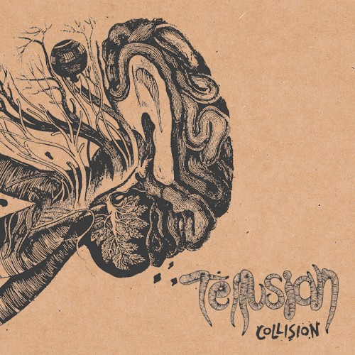
(In this post, Austin Weber brings us an exclusive song premiere and provides the following introduction to the music of Tellusian from Malmö, Sweden.)
While Crowpath have been broken up for several years now, a new outfit (new to most people) called Tellusian has sprung from their demise. Including in their ranks both Crowpath’s vocalist Henrik Ivarsson and drummer Erik Hall, Tellusian have been slowly teasing out their curious and amorphous nature in short EPs. Now they are gearing up to release Collision, their debut full-length. After talking with them, they graciously agreed that an NCS song premiere would be cool, and they chose “The Collyer Brothers”.
The song is a journey that, once it unfolds, reveals an oddball progressive nature nestled inside a ravenous core. Expanding freely from a recurring central riff segment, the song dives into technically complex sludge with death and black metal shards, and sneaks in a luminious instrumental reflection toward the end. “The Collyer Brother” lurches and grinds in perfect yin/yang layering. The monstrous growls, shrieks, and roars of Henrik Ivarson serve to blanket the song with a palpable sense of disgust. Caught up in the whirlwind are carefully balanced hypnotic leads and a warm, delicious bass presence prone to following its own path, all fused to a backbone of pummeling, stop-start drumming hell-bent on destruction.
Collision has a release date of sometime in mid-March from what I was told. Having had the pleasure of immersing myself in the entire record courtesy of the band, I can assure you it’s potently mindblowing metal of the highest uncategorizable eclectic order. Keep a watch, Collision is coming, and you don’t want to miss it.
In addition to “The Collyer Brothers”, you can also listen to the album’s previously released opening track, “Rivalry”, below.
https://www.facebook.com/pages/Tellusian/187832791256105
http://tellusian.bandcamp.com/album/collision


Nice track. Will take a few listens to really set in though. And i like the new version of the Soundcloud player, although it seems to have copied the bandcamp format of the same. Yet it looks complete and fuller than BC’s version of it.
I like the artwork layout (which, as you said, is pleasantly reminiscent of Bandcamp’s look), but the barcode look of the sound waves is pretty stupid looking
True. I initially thought that it was some kind of display error. Jarring. Would have prefered a lighter translucent version of the previous one.
Rivalry is more catchier. Need…. more….