(Guest writer Ty Lowery has assembled a personal list of favorite metal album covers for 2014 to date, divided into two parts. Part 1 appeared here. Once again, Ty asked his wife Heather (who he says isn’t very big on metal music as a whole) and his friend Adam (who is) to look at the album art and provide guesses about the music. Once again, please feel free to add your own favorites in the Comments.)
Alright, so the first round went pretty well for my two assistants. Where we left off, they were neck-and-neck in our little guessing game. So, time to finish this thing up and see if the trend continues. Lets get right to it, shall we?
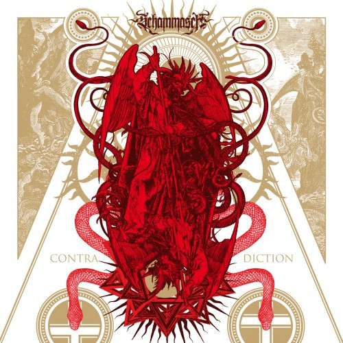
Schammasch – Contradiction
There’s just something about the color red with me, for some reason. I really like how while the majority of this artwork is solid red, yet there’s enough variation that you can divine the angel, the demon, the symbols, and the serpents. With that knowledge, Heather was able to correctly suggest that this album was steeped in religious undertones, probably in the vein of black metal, as did Adam. He suggested that it might have something to do with atheism, but changed his mind after seeing the symbols along the bottom.
The cover art is by Valnoir of Metastazis Studio in Paris. NCS reviewed the album here.
http://www.graphic-noise.com/valnoir
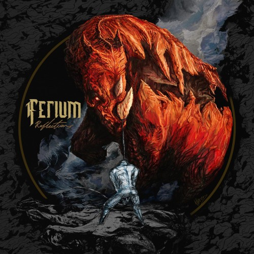
Ferium – Reflections
Sticking with the red theme, Israel’s Ferium have released a killer album this year (which I reviewed here) and their album art is a good representation of what lies within. Heather also guessed black metal here, which is incorrect. Adam thought the cover represented a metalcore band, and I could see the connection there. A good number of bands in that genre tend to place animals of some sort on their covers. Personally, I believe that regardless of genre, the rhino on the cover is the centerpiece and the thesis of this album. I would guess that when people think of animals that represent metal, they either think of lions and razorbacks, ready to rip your throat out at a moment’s notice, or an elephant, representing the riffs prevalent in a number of the sludgier sub-genres. The rhinoceros is a perfect representation of this album: it’s huge, odd in places, and will gore the shit out of you if you’re not careful.
Artwork painted by Eliran Kantor
http://www.elirankantor.com
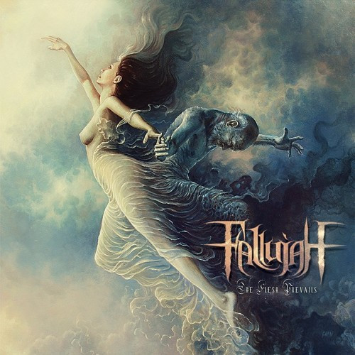
Fallujah – The Flesh Prevails
“This represents the band perfectly,” says Adam. He knew them before, so he obviously guessed the genre. Heather, having never heard of them before, guessed they were just straight heavy metal. While it’s not as easily defined as technical deathcore or whatever, they’re a little more than just straight metal. Adam was pretty spot-on when he said this artwork exemplified the band’s music. The ethereal feel to the brushwork here corresponds nicely with the flowing rhythms and sweeping solos present through the majority of the music. When listening to the album and looking at the art, you can almost imagine the artist was doing the same when he was painting it, which may be somewhat true — the art is described as a collaborative effort between Poland’s Tomasz Alen Kopera and the band’s vocalist, Alex Hofmann. (NCS reviewed the album here.)
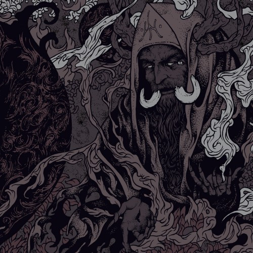
Ancient Ascendant – Echoes and Cinder
Heather took death metal away from the cover art of Ancient Ascendant’s sophomore release (reviewed here). Adam suggested that it both looked like a Darkest Hour album, and would probably sound like it as well. That’s better than I got. I was expecting something along the lines of either folk or post-something or another. Good on Heather, not so much on Adam or myself. The linework drew me to this cover, though you should know by now that I usually like a lot of color in my album art.
Artwork for this album was provided by Rotten Fantom
http://www.rottenfantom.com/
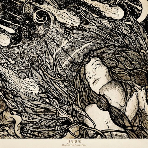
Junius – Days of the Fallen Sun
Heather didn’t get the genre right, relying on the consistent death metal response, but she nailed it when she mentioned that this looked like a concept album. Adam also suggested astrology as a theme, which is close enough for our purposes, but he also guessed incorrectly on the genre, citing metalcore. I think this is one of the best albums covered in this list, if for no other reason than the concept is easily divined from the artwork. This Exception to the NCS Rule (reviewed here) is a spellbinding story about a civilization’s blunders as a meteor plummets its way toward Earth. The artwork is a scene directly from this story, made obvious by the falling stars adorning the artwork.
Adrian Brouchy, who works under the name of Coven Illustración, provides the cover art. According to this interview, he has worked with Junius before.
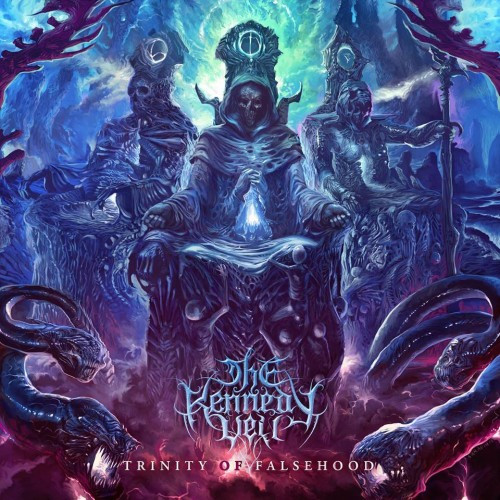
The Kennedy Veil – Trinity of Falsehood
This album art stands out to me for no other reason than its color. Purple is my favorite color, so naturally I love the shit out of this cover. Heather thought these guys were black metal with dark themes. She got the dark themes part right. Adam, seeming to tire of this exercise at this point, suggested metalcore again, with no particular theme or context. The Illuminati and the desecrated souls holding up their thrones are evidence enough of some kind of darkness within, but there’s no specific concept for the music represented. Aside from the beautiful color scheme, the art itself is quite striking. Considering that Ken Sarafin also did the artwork for The Lucid Collective (which was featured in the first part of this list), it’s only natural that I would like this work as well. (NCS reviewed the album here.)
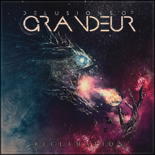
Delusions of Grandeur – Reclamation
Rounding out our list is Pennsylvania’s Delusions of Grandeur. Heather thought it was just “normal metal”, with a space exploration theme. She agreed with me in really liking this artwork, noting that it had a Decepticon feel to it. Adam hit it front and center with his deathcore assumption. He also noted that it looked like it would involve themes similar to those in the music of Aegaeon. Being a deathcore album, the screaming monstrosity breathing fire on the earth speaks a bit to the aggression in the music, and in places it tries to reach out beyond our atmosphere here on Earth.
Artwork was done by Memoria Designs
http://memoriadesigns.tumblr.com/
This time around, Heather only got two of the seven correct when guessing the genres. Adam went four for seven this time around, so this round goes to him. However, what I found more interesting is that Heather and Adam both got over half of their guesses correct when speculating about the context or themes of the albums. Again, take that for what you will, but I think that’s a pretty neat correlation.
So there you have it folks: Sixteen albums with absolutely kickass album art, the majority of which offer some sort of insight into what’s going on in the album itself. I’d like to thank Heather and Adam for helping me with this article. I’m sure there’s plenty of great album covers that I’ve omitted, so please fill up the Comments section with your favorites so far this year.

The Junius, Ancient Ascendant, and Fallujah covers are gorgeous.
I agree…naturally. I really like the clean feeling the Junius and Ancient Ascendant albums have. Too often these type of albums seem to feel like unfinished sketches.
the Trinity of Falsehood artwork is my favorite of these, it’s so awesome
You can almost always tell a band like The Kennedy Veil plays techdeath…way too many bands in that sub-genre use some variation of that font in their logo
Yeah. That’s one of the biggest indicators of death metal, in general. If the logo looks like it’s wrapped in a spider web, there’s gonna be some tech in there somewhere.