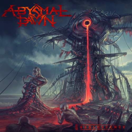
We probably devote more attention to album art than the average metal blog, and the Swedish artist Pär Olofsson has been one of our favorites for years. His cover for Obsolescence, the new album by Abysmal Dawn, is a striking example of his work — and the album is damned striking, too.
So it’s a genuine treat for us to bring you this feature, narrated by Pär Olofsson and Abysmal Dawn vocalist/guitarist Charles Elliott, about how the album art evolved, with step by step images of the artwork, as it eventually took shape in the exchange of ideas between the two.
If you haven’t yet listened to Obsolescence, which is out now on Relapse Records, do yourself a favor and dive into that (you can here it and buy it on Bandcamp). It’s superb. You can find out more about the band and the artist via these links — and at the end of this post, check out their new video for the song “Inanimate”:
http://www.parolofsson.se
https://www.facebook.com/pages/Par-Olofsson/105986612785663
https://www.facebook.com/AbysmalDawn/
You can view larger versions of any image in this post by clicking on it.
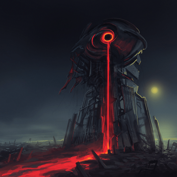
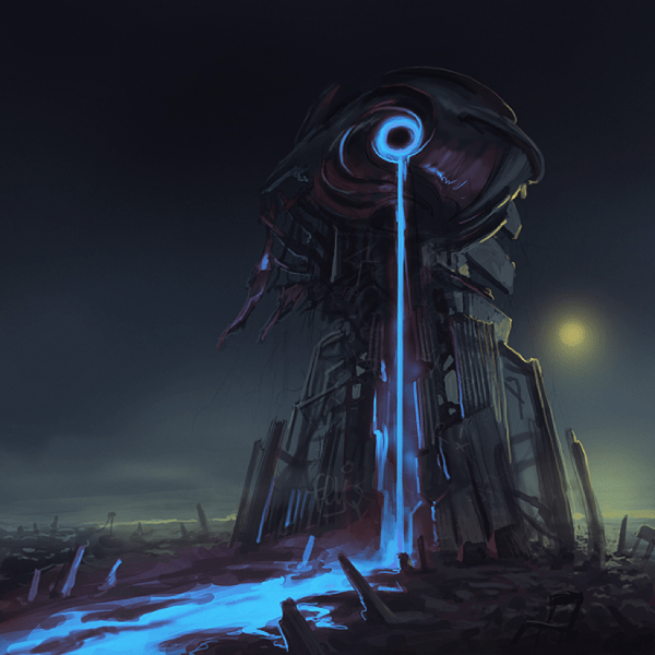
Charles: These were the initial ideas Pär came up with. I didn’t have a title or any lyrics at the time so I just hit him up to see if he had any ideas to start. I think the only thing I asked of him was to try and avoid a cityscape and try and do something different with the eclipse. I opted for the red version purely because I always wanted to use our red logo on a cover.
Pär: I think Charles mentioned a monolith as well. My initial idea was that the monolith was built by people as some kind of shrine to the eclipse, built with whatever debris they could find. I wanted to do the blue version, only to avoid the red to be mistaken for blood. In the end I´m happy we went for the red though.
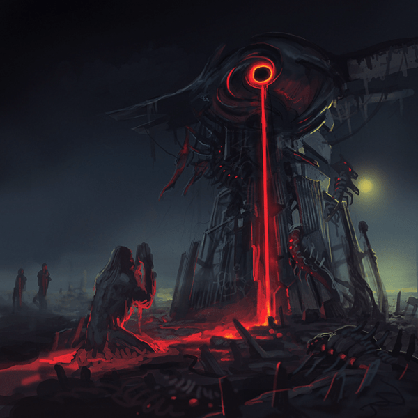
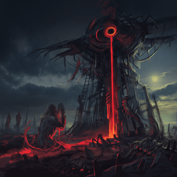
Charles: We’ve always tried to incorporate elements of our past album covers in the new one I guess. Pär added the bugs from the last cover to this one. I suggested people being fed into the monument somehow and this is what he came up with.
Pär: I really like those bugs, with the glowing “eyes” on their bodies.
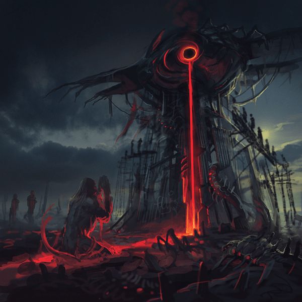
Charles: Pär thought the people should be absorbed by the goo and tried to convey that in this sketch. The sky was starting to look cooler as well. I didn’t really like the religious connotations of the guy praying and felt the guy on the ladder made the structure look smaller. I kept pressuring him to have people be actually fed into the structure somehow haha. He was trying to avoid that, however, since he’s done that on a few covers. At this point I suggested a winding staircase leading into the structure.
Pär: The wings on the structure now have “scarecrow fingers” to break up the clean lines of the previous wings, also it just looks more menacing.
Charles: This one was a step in the right direction. It’s more psychological because it’s implied that the people are marching to their doom, but it isn’t really shown. Still thought the people were too big and didn’t like the praying figure.
Pär: I didn’t see the figure as praying, rather begging for forgiveness or mercy. Also it was good for the composition to have him turning right, facing the “eclipse-machine”. But I understood Charles’ concern with the somewhat religious pose. Also it would’t make sense why this dude wasn’t climbing the stairs like everyone else.
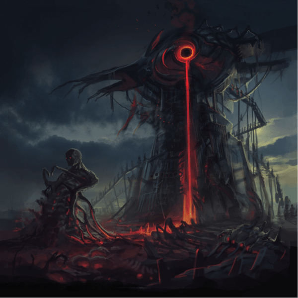
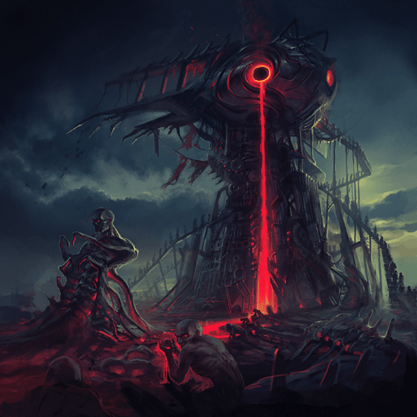
Charles: The scale of this one was finally getting close. The people on the staircase are smaller and the staircase in general is much cooler. The liquidated people are then feed into the bug/man hybrid at the bottom. I liked it but I still thought the symbolism could be stronger.
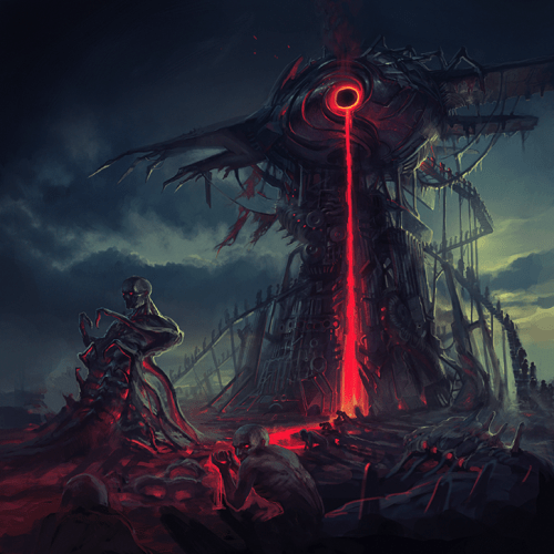
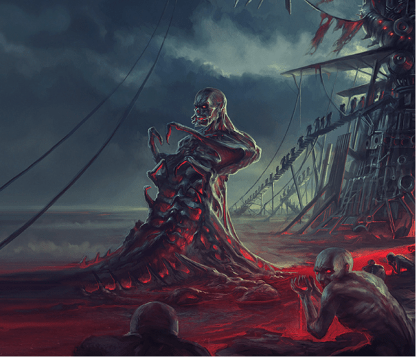
Charles: This was awesome. I mentioned H.G. Wells’ “Time Machine” to Pär at one point. I wanted some desperate human scavengers at the river, sort of like the Morlochs, crouched down and drinking the goo. The idea made sense to me finally and I got the symbolism I wanted out of it. People were being fed into the monolith by the bugs (ruling class), and the scavengers (poor class) that would eventually meet the same fate were feeding off the liquidated dead of their peers. The half man/half bug represented those who conform to our society. It’s basically what’s left of humanity after the sphere from the “Programmed…” cover destroys everything. The bugs from the “Leveling…” cover are now the ruling form of life on the planet. So this would be the next scene in that story.
Pär: I agree to the above, the scavengers really tied things together, also that one guy looking at us is kind of creepy. Also the red goo has the right color now. My initial fear was that it would look like blood, but the glow made it look like melted metal or lava in the previous image. This color is something different, but even so, some may interpret it as melted metal since the brain always try to make sense of things it has never seen before, so…
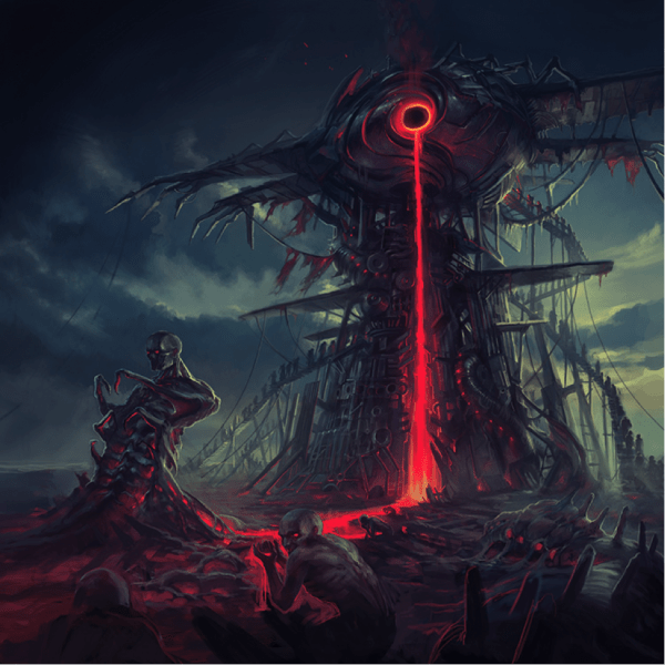
Charles: We tried something slightly different with the structure for some reason here. It kind of threw off the balance of the piece though, so we reverted back to the old design.
Charles: The wings came back in on this one and we modified them a bit.
Pär: The structure was a bit top-heavy, so I added some “wings” for balance.
Charles: I think I asked him to make the main bug less human looking so he changed his mouth. I told him I thought it looked too much like Bane and asked him to change it haha. I suggested some “mandibles”. Actually Pär remembered the proper English word for that before I did. Stupid Americans.
Pär: At this point it was mostly a matter of refining details. It’s a tedious job but very rewarding in the end, especially if there is going to be a vinyl!
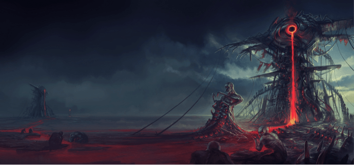
Charles: Pär extended the scenery a bit and made it ever more awesome! I still thought the main bug could be more intense looking.
Charles: Main bug looking even meaner here!
Pär: Yes, it’s the mandibles hehe
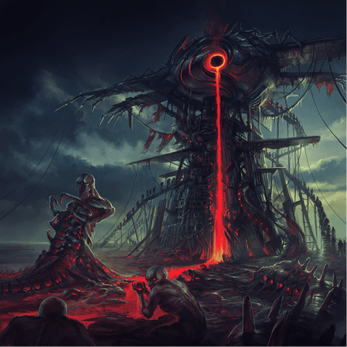
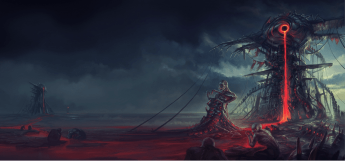
Charles: The finished product! Aside from touching up the fine details, we removed the smoke coming out of the “eye/eclipse”. We didn’t want the goo to be mistaken for lava so it made sense. It took a bit longer to put this one together this time but it was totally worth it. Pär had said he wanted to do something special for this album and he did just that. Probably our coolest cover yet!
Pär: I think Charles has a little perfectionist in him, and together with my similar personality it sometimes gets a bit demanding. However, it is all worth it in the end, I’m very happy with the piece. It IS the coolest Abysmal Dawn cover yet.

By odd coincidence, my review of this should also be going up today…
The cover art is impressive and pairs perfectly with the gorgeous manboobs in the video.
Awesome post – killer artwork for a killer record. Having worked with Pär on a cover art commission last year I can attest to how great he is to work with. He’s a master at bringing the most bizarre visions to life.
this is artwork is so gorgeous : )
and this album is awesome!