A long time ago, and for many years, I used to regularly write a feature called EYE-CATCHERS in which I tested the hypothesis that cool album art tends to correlate with cool music. There’s no sense in that proposition, if you think about it, yet the experiments I conducted proved the proposition more often than they disproved it.
Like many other older features here, that one fell by the wayside, for reasons I can’t explain. And I’m not really reviving it on a regular basis today. But it came back to me when I listened to the following songs for the first time last night and this morning.
DISBELIEF
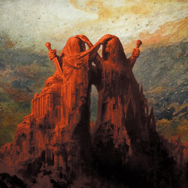
This first song isn’t really entirely in keeping with the original concept behind EYE-CATCHERS, which was to explore music by bands I knew nothing about based solely on the artwork. In the case of Disbelief‘s new song, I had a recommendation from fellow NCS scribbler Grant Skelton, and so I would have checked it out regardless — but as soon as I saw the artwork by Eliran Kantor, that sealed the deal.
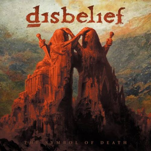
The original piece is above, and even in the final cover with the band’s name and album title visible, it’s still largely un-obscured, which proves that someone had their wits about them:
It’s a wonderful piece, which isn’t surprising, since Eliran Kantor seems to do do nothing that isn’t wonderful. Now, what about the music?
The song below is “Full of Terrors“, and it comes from an album blessed by this cover, The Symbol of Death, which will be released today by Listenable Records. This is Disbelief‘s 10th album in a career that stretches back to the very early ’90s, and yet, surprisingly, we haven’t written about them before at our putrid site.
“Full of Terrors” is a real death metal ass-kicker. It has turbocharged percussive drive, coupled with a bouncing groove and strains of eerie melody swirling and darting around all the pneumatic demolition work. The rasping, howling vocals are damned good, too. The song is recommended for fans of Bolt Thrower and Obituary. I’m marking it down as evidence that strongly supports the hypothesis about cool album art correlating with cool metal.
Order:
https://www.shop-listenable.net/fr/214_disbelief
Disbelief:
https://www.facebook.com/disbeliefhell/
LOYAL UNTIL DEATH
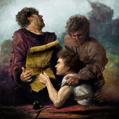
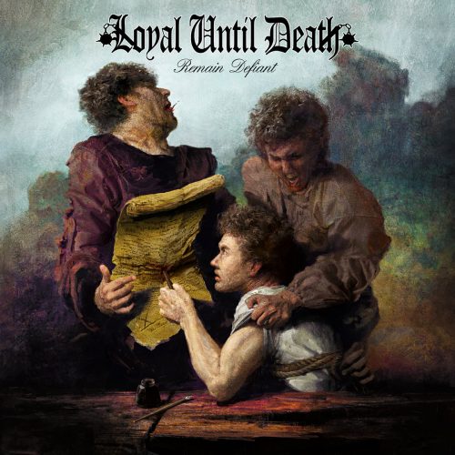
After discovering that Eliran Kantor had created the artwork for Disbelief‘s album, I decided to pay his Facebook page a visit to see what else I might have missed, and there I found the piece you see above.
I would love to find out what inspired this tableau from what seems to be a much earlier age — a bound man (but not bound well enough), a pen and an inkwell and a long parchment of words, a second man trying too late to prevent the violence, and a third man, an authority figure, feeling the sharp spike of resistance, with the first spurt of life’s blood ejected from his mouth.
Here is the final cover:
Well, it actually might not be that hard to imagine what inspired the visual art. You might just have to look at the album’s title — Remain Defiant — and listen to the title track, which was released earlier this month. It’s by a band from Pompano Beach, Florida, who call themselves Loyal Until Death.
Words that come to mind in listening to this barrage of hardcore ferocity are “bruising”, “battering”, and “mauling”. It’s shot through with punishing grooves and blood-red vocal fury, driven by huge low-end power in the rhythm section’s sound and head-whipping riffs that provide a surge of adrenaline. More good proof of the the crazy EYE-CATCHERS hypothesis.
Remain Defiant will be released on June 16. The title track is available for purchase as a single now.
Buy:
https://loyaluntildeath.bandcamp.com/track/remain-defiant-4
Loyal Until Death:
https://www.facebook.com/pg/LOYALUNTILDEATH/
SHOW OF BEDLAM
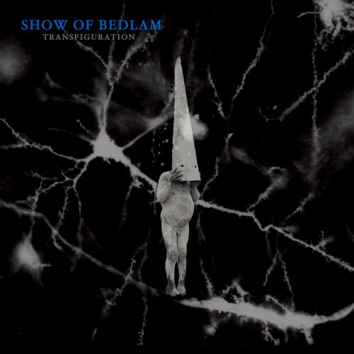
Eliran Kantor has a level of artistic talent that few metal artists can match, but cover art can catch the eye for other reasons, too. For example, the cover of Show of Bedlam’s new album, Transfiguration, is eye-catching simply because of how creepy and bizarre it is.
I’ve looked and can’t find the name of the person who created the strange image for this Montreal band’s second full-length, but it did make me curious about the music. I admit that the fact that Sentient Ruin is releasing it also biased my decision to check out some music.
The song that’s available now is “Tælus“. It’s a sludge/doom monster that’s obliterating on so many levels that the only one left standing is Dante‘s Seventh Circle of Hell, the one named Violence.
Like the cover art, the song exudes a creepy, skin-crawling atmosphere at first, one that builds tension and dread — and then the band start to crush and cremate. The groaning and braying chords are bleak and tormented, and you can feel the mid-paced bass-and-drum clobbering right down into your marrow. The vocalist’s wails, yells, muttering, and shrieks add to the intensity (and to the air of derangement that comes off the music, thanks in part to some twisted guitar leads). When the pace eventually picks up, “Tælus” becomes catastrophically destructive. Yes indeed, more supportive evidence for the hypothesis….
Transfiguration will be released on May 12.
Order:
https://sentientruin.bandcamp.com/album/transfiguration
Show of Bedlam:
https://www.facebook.com/Show-of-Bedlam-231634652456/
DYSTOPIA
Now I’ll turn to another artist who, like Eliran Kantor, is one of my favorites — Portland’s Adam Burke (Nightjar Illustration). The artwork above is a piece that appears on the cover of an album named Chaos Philosophorum by the Dutch band Dystopia. The album was just released today, and I haven’t listened to all of it. I found that I had received a press release about it earlier this month which included the explanation that the album’s themes “deal with space, existence and death”, plus this comment by the band about the artwork:
“We wanted to combine these concepts in our artwork, so we took the medieval plague doctor as a strong and recognizable symbol of death, and combined it with the almost magical shapes and colors of a galaxy. As if he is casting a spell. The artist Adam Burke did a tremendous job converting our ideas into this artwork.”
This is another true example of the original concept behind EYE-CATCHERS, because I wasn’t familiar with the band’s music before being drawn to it by the cover art. The track you’ll hear upon launching the Bandcamp player is “Through the Vortex“, and I’m really liking it.
Over the course of more than 10 minutes, the music provides an immersive experience, combining elements of black metal, post-metal, and progressive metal (among others), with changing tempos and vocal styles, and a persistent vibrancy coursing through its dark pathways. The sludgy sound of the low end, coupled with the rapid-fire performance of the rhythm section, delivers a powerful drive, and the guitarists spin out a changing array of scintillating leads. I’m looking forward to hearing more of the album, because this song is a clear winner.
Buy:
https://dystopianl.bandcamp.com
Dystopia:
http://www.dystopiaofficial.nl
https://www.facebook.com/dystopianl/

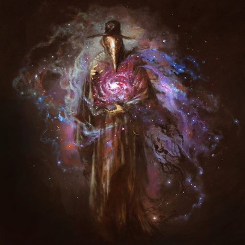
I like that Dystopia went without lettering on the cover. Great cover art should both stand out on its own and also be representative of the music within. From what I’ve heard so far, that is the case with this record. All too often poor graphic design choices (“Let’s make the logo nice and big, translucent on the inside and then add a drop shadow!”) totally ruin an otherwise great cover.
Your post made me revisit Disbeliefs first two records. Amazing stuff, especially the “Imfected” album. This is like if Kirk Windstein had taken another turn after listening to Bolt Thrower. What a voice too.